How to Filter the Good From the Bad in Cover Design
OWFI March Virtual Workshop Transcript
March 29, 2018

Marya Heidel [2:29 PM]
joined vw_maryaheidel along with 6 others.
Pepper Hume [5:24 PM]
Are stock photos really better than good art work? They seem to be more popular.
Sabrina Fish [6:33 PM]
Hi Pepper!
Marya Heidel [6:52 PM]
Hey! I'm here. ^_^
Sabrina Fish [6:52 PM]
Welcome, Marya! We're so glad you could join us!
Marya Heidel [6:53 PM]
Happy to be here!
Sabrina Fish [6:53 PM]
Everyone, please be sure to scroll to the top of the page and read over the workshop etiquette.
Pepper Hume [6:54 PM]
Guess I sent my question prematurely. Should I type it again and wait for Q&A to send it?
Sabrina Fish [6:54 PM]
I'll introduce Marya officially in about 6 minutes, then we'll let her get started. @pepperh,if Marya would like to answer now, she is more than free to do so.
Marya Heidel [6:56 PM]
I don't mind answering. ^_^ Stock vs. Art is really subjective and genre specific. Some genre's almost require it, and some really don't. So I wouldn't say either is better than the other.
Julia Mozingo [6:56 PM]
joined vw_maryaheidel by invitation from Sabrina Fish.
Pepper Hume [6:57 PM]
Thanks. I really meant it to wait for Q&A.
Marya Heidel [6:58 PM]
No problem, if you want to discuss it more after just let me know. ^_^
Sabrina Fish [6:59 PM]
Welcome, everyone! Please be sure to scroll up and look at the workshop etiquette.
at the very top of the page
Welcome, everyone, to OWFI's 4th official Virtual Workshop. I hope you've enjoyed this year's new endeavor! I've certainly enjoyed organizing it for you. Let's go ahead and get started. Our speaker tonight is
Clean Teen Publishing's Marya Heidel.
Marya Heidel has ten years of experience in customer relations and creative design. In 2011, Marya entered the publishing world when a friend asked for her help in designing their book cover. Soon, she found that she had a knack for image manipulation and an eye for bringing multiple elements together to create a visually stunning cover. Marya decided to do what she loved and began freelancing as a cover designer, and later went on to open Clean Teen Publishing. She's now designed books covers for New York Times bestselling authors like Raine Miller and Tina Reber, USA Today bestselling author Quinn Loftis, and countless other best selling authors both published and independent. She has a focus on visual communication and uses Adobe Photoshop, Indesign, and Illustrator. She understands that typefaces, hierarchy, color, images, and placement are essential elements to creating a stunning and marketable visual design. She also does marketing graphics, print materials, and logo design. Marya was recently honored with her second RONE Award for one of her covers and has received numerous other accolades for her gorgeous designs. Marya believes that people do judge a book by its cover and she’s determined to make the publishing world a more beautiful place, one cover at a time.
Outside of the business world, Marya Heidel is the mother of two amazing little boys. She loves running, obstacle course racing, weight lifting, zumba, and just about anything creative or active. She considers herself extremely lucky to be doing what she loves in both her business and simply living life to the fullest!
Welcome, Marya. We are really looking forward to your presentation tonight!
Just a reminder to everyone, please hold your questions until Marya either finishes her presentation or asks for your questions.
Take it away, Marya!
Marya Heidel [7:04 PM]
Hello everyone!! Thank you for being here tonight to listen to me ramble away. ^_^ Cover design is definitely a passion of mine so I've really looked forward to doing this presentation.
So... let's get started!
What elements work for sales and what won't?
Font is a big part of cover design. The words on your cover are just as important as the image. It's easy to tell when someone just types out the title and when a designer designs the typography. But it can go too far as well. Over design is just as bad as no design. You want to make sure people can read the words, and you want your type to be one of the main points of focus.
Pepper Hume [7:04 PM]
:heart:
Marya Heidel [7:05 PM]
On the image, there should be some sort of focal point, but you don't want it to be too busy. We see movie posters that have 20+ characters on them, but that is a tough thing to pull off well with a book cover. Plus, you really don't need every character, object, or element on your cover. Its purpose of the cover is not to tell the story, but to get readers to pick it up!
I cannot stress how important it is to have good photo manipulation and/or artwork on your cover. I'll go over this in more detail in a moment, but this is a big component that is crucial to success.
Stock doesn't have to look like stock. A good designer can take six to ten images and make a cover completely unique. But again, this takes talent! And good manipulation matters. It's easy to take a stock image that already looks amazing and just put some great type on it… but I can almost guarantee that even if that image isn't in use now, someone else will eventually use it. That said, it's also not the end of the world if someone has a similar cover. But it can affect your branding.
Colors matter, too. The most appealing colors tend to be reds and blues, but other combinations can work just as well. Doing some color research might help you to better understand the feelings you want to evoke with your cover's colors. But you also need to look at color trends for your genre.
What makes a cover the perfect marketing tool?
Your book cover is the first thing readers see. In the vast ocean of books that is the reality of the eBook, the cover matters even more. People really do buy books based only on its cover. And studies have shown that what most attracts a reader to a new book is the cover, and then they move to the synopsis. It is very important that you have a professional look on your cover. It's your first impression, and people will judge. If your cover looks sloppy and like it was just tossed together, people will assume that the interior is the same. If the photo manipulation is poorly done, they will think you obviously don't make enough money selling books to afford a quality designer. And they'll think that if you can't do that, you probably can't afford a good editor either…and the impression will be formed that you just don't really care or know what you're doing at all. Who would want to read a book from someone who doesn't care about their product? It also screams 'inexperienced' and people know, even if they don't really realize it, that everyone's first draft sucks. Experienced, successful writers have beautiful cover art.
Cover art is also an amazing way to create a visual brand. Once you have something people love, you can use it on everything. We've all heard that it takes a person seeing something seven times before they retain it. And the cover is a great thing for them to retain. You can use it for advertising, contests, paper swag like bookmarks and rack cards, pens or collectable pins, business cards, compacts, chapstick, or whatever new and cool swag people are producing. The more readers see that image, the more they will remember your book.
How to choose a cover designer to fit your projects requirements?
First thing first-Start Early. Some designers are booked a year out. Those designers are usually the most experienced.
The next thing you need to do is research your genre.
Don't skip this step!
Many authors get so caught up in their own ideas of what they've dreamt of having on their cover, and it becomes a very emotional attachment. But this is a business, and the goal is to sell books. And sometimes the idea you have might be amazing to look at, but not so amazing when it comes to attracting the right reader for your books.
Research the top sellers in the genres you write in. Save the covers of the ones you like best. Take note of trends and keep looking because trends always change. And this isn't to say you have to make something you hate just because it's trendy. But if you write a cozy mystery right now and you don't have a cute cartoonish cover-if instead you decide to have a dark and mysterious brooding male on your cover-you won't attract the right reader no matter how awesome the cover is.
Those who do read your book won't buy more of your books. They might write bad reviews because they read something that wasn't what they were expecting. And those people who would love your work will never realize the love because they won't recognize your book as something that's up their alley, based on the cover alone.
After researching your genre, look at a variety of designer portfolios, and pick one who already designs covers you love in your genre. You might find someone who designs amazing horror monsters, but you don't want to ask that person to design your cartoon cozy. Now, some designers have talents in a broad array of genres. But they usually have that array on display. And if you like their Urban Fantasy covers, but not their YA stuff, don't ask them to do a YA and expect to get something as good as their UF.
Once you've found a certain style that you want from doing your research, pick a designer who has work you like that matches the style you've decided on. So say you've found an awesome UF designer, but they don't have anything that's in the style of UF you want, you should just keep looking. It will save you and the designer some frustration. Now, that's not to say you can't get an amazing design from someone who hasn't done what you want before. I attempt new things all the time and have had great results. But there are also times I try new things and have horrible results. I'm not great at everything! Lol! And it's just a safer bet to go with someone who you know can do what you want.
Next, look at their testimonials. Most experienced designers will have a page for reviews of their services. Or they'll have reviews on their Facebook pages. Look for words in the testimonials like 'timely completion' and 'professional' and 'friendly' or 'fun to work with'. Over the years, I have worked with people who have amazing talent, but horrible social and/or business skills. And while talent is very important, the talent won't matter if the process is like pulling teeth.
If you can't find any listed testimonials-and sometimes even if you can-message the authors they have done covers for and ask for their opinions on the designer.
Be polite, be friendly, play to their ego, and say something along the lines of, "Hey, I'm looking to hire Marya Heidel and I saw she did your cover for Book A. The design is just amazing! It's one even I want to pick up and read. Would you mind telling me about your experience with her?"
Though do keep in mind that some people just don't mesh well, and no matter if you get a positive or a negative reply about the designer, you'll want to ask a few more authors who have worked with the designer.
Once you've narrowed it down, ask your chosen designer if they have the availability to do your cover in your time frame and if you can read their contract. Some designers I know are already booked for the remainder of the year. Every designer I know has a unique contract. If your designer can schedule you, read the whole contract, ask questions if you have any, and make sure you know and understand the rules and agreements before agreeing to work with them. Don't be afraid to ask for changes to things you don't like, but also don't be shocked if they say no. Be polite during these times. If you can't come to an agreement, just move on. There are lots of designers out there to choose from.
Do's and don'ts of working with a graphic designer.
DO give your designer as much info as you can. Important objects in the story, descriptions of characters, and the feeling you want to evoke-Dark and mysterious, fun and light, etc.
DO fill out the designer's questionnaire as completely as possible.
DO give them some free rein to make it awesome. The less you try to control every detail, the better the cover will be.
DO make a folder with all the genre research you did and show your designer the covers you LOVE.
DO listen to your designer's opinions on what will sell and what wont! They are experts for a reason.
DO expect to pay a deposit up front. Usually half the total design fee. Not all designers do this, but you should not be shocked by it. It is common practice. If you did your research on your designer, you'll know they aren't the shady sort who would take your money and run. Designers do this to protect themselves and make sure the author is serious about reserving their spot on the schedule. Time is money, and if an author fails to 'show up' for their appointment, that's money lost.
DO get back to your designer as quickly as possible when they ask for feedback. Designers have a specific time frame they have laid out for you. Waiting a week to get back to them can bog up their schedule and every other client after you. We don't expect you to be at our beck and call, but it's generally good to go by the twenty-four hours or less rule. We know you have lives and just as much marketing, accounting, and business running to do as we do.
DO let your designer know when and how you'll be sharing your cover with the world! Even if you opt not to do a fancy cover reveal, let them know when it'll be ok for them to share it. We love what we do. Sometimes it just awful to have to sit on a cover you love and not share it. It's also a big part of our marketing to show new work, and we can even help you promote your book. Win/win!
DO credit your designer in your cover reveal and on the inside of the book. This is very important, and there is usually a requirement for this in the contract you sign with your designer.
DO tell all your author friends how amazing your cover artist was, how you loved working with them, and be sure to sing their praises. Word of mouth is by far our biggest avenue for new clients.
DON'T Be so super specific to your story, characters, or objects. Not to say it doesn't matter if the general ideas like eye/hair color, build, skin tones, and things like that don't match, but don't reject every model because she doesn't look exactly as you pictured the character in your head. Your mental picture won't match the readers mental picture anyway.
DON'T have your designer make one type of cover, and then change your mind after it's done and ask for something completely different without compensating them for the design they have already created. Our fees are based on the time it takes to design a cover. Time and skill are what we are selling you more than anything. And if the design of your cover is taking more and more time because you aren't sure what you want… then you should consider the possibility that you have overstepped the terms of the original agreement with your designer.
DON'T be afraid to tell your designer you don't like the cover or the direction it's going. Your designer wants you to be happy with the end product; it won't hurt their feelings. Designers are professionals, and they don't take critiques as personal attacks. But make sure you are being constructive and polite!
DON'T change your mind thirty times within the design process. This is why research is important. You should have a very good idea of what you want before you hire someone to make if for you. But on the flip side…
DON'T have your heart so set on some specific look that you turn down any alternative presented to you. Sometimes the art bug bites and the new idea is WAY better than the old. Take the time to consider it.
DON'T go on social media and publicly bash a designer you did not get along with. Be professional. The simple act of not using them again and not referring them to others will hit their pocketbook. If you feel the need to warn other authors, do so privately. I don't say this to protect bad designers, I say this to protect you. Going into any public forum and ranting about anyone is just generally a bad idea-be it designers, editors, reviewers, other authors, or even readers. You never know who is watching, what connections they have, or how that will make a reader or another business professional feel about YOU.
DON'T ask your neighbor, cousin, mailman, or the guy you bumped into at Walmart what their opinion is and take that over your designer. Again, we do this for a living and the majority of good designers have a better idea of what will sell in the genres they design for than your average Joe. Take what others say into consideration, but give your designer's opinion more weight.
DON'T expect your designer to be at your beck and call. We have lives and things going on, too. We don't actually work 24/7, even though sometimes we are online at crazy hours. If we are actively working a project with you, you ARE a priority. But don't get upset if we don't respond immediately or even within the hour. Again, I think a good rule of thumb is twenty-four hours or less. It won't always be twenty-four hours, but don't get upset if it is. We are multitaskers! There is marketing, accounting, scheduling, and a whole lot of hats that go along with running your own business ( as you know). And then there are things like family and life in general. It happens. :wink:
And that's it! There are probably things I'm missing here and there, but I hope this is a good overview for all of you and that I didn't go too fast! I think now we open up for questions? Right Sabrina?
Sabrina Fish [7:40 PM]
Yes, ma'am!
Robert Rubin [7:40 PM]
??
Sabrina Fish [7:40 PM]
Robert
Robert Rubin [7:41 PM]
I know you can't speak for the industry at large, but do you have a feel for how often an author's input is common for a cover in traditional and/or small publishing? Like many things, is it genre specific? I know that there have some recent, ah, controversies with regard to cover art in the publishing world, but I just didn't know if you had an ear for where the traditional publishing world was heading in terms of authorial agency.
Pepper Hume [7:43 PM]
??
Marya Heidel [7:46 PM]
I would say the smaller publishers give the authors much more say in cover design. With CTP our authors are very involved in the process and we do just about everything we can to make sure they are happy with what is created. It's my experience that most small to mid list publishers operate that way, but there are still some that follow the big pubs. Big pubs seem to still take the author out of the design process. Cover design is done by a marketing team with little input from the author. I think that MIGHT be changing as the big 5 see more and more authors go indi, but I don't think it's something that will change quickly. That said, the big guns aren't totally wrong in how they do things. A cover IS a marketing tool and authors can be way to emotional about it. But I think we all need to find a happy medium. I pride myself on how we do things at CTP and I hope more publishers will see the example we set.
Sabrina Fish [7:46 PM]
Pepper
Pepper Hume [7:46 PM]
If reds and blues are the most appealing/popular colors and there's a sea of red and blue covers out there, isn't it a better plan to use colors that will stand out as different?
carolyn leonard [7:47 PM]
??
Marya Heidel [7:49 PM]
Sometimes yes, sometimes no... it really depends on HOW you do it different and the shades you use. And people like what people like. There's lots of research about how color affects people and what emotions they evoke. It's kinda like the rule of thirds. Some things are just more attractive and even if every cover has a certain color range, it's still what people will gravitate towards.
Sabrina Fish [7:49 PM]
Carolyn
carolyn leonard [7:49 PM]
Specifically what typefaces, color, and placement do you feel are essential elements on a winning cover?
Marya Heidel [7:52 PM]
Oh man... there really aren't specifics that I can give you. It's art. lol! Different genre's have different type styles that are 'winning'. Same with placement and color. That's what research is so important. And trends change! So what's winning now, could be old news next year. Hang on just a sec and I'll post some examples of some of my favorites.
carolyn leonard [7:52 PM]
I'd love seeing examples!
Pepper Hume [7:52 PM]
Me too!
Marya Heidel [7:53 PM]
uploaded this image: Ebook - Never Touched WEB.jpg

carolyn leonard [7:53 PM]
Another related Q. Are there different standards for non-fiction covers?
Marya Heidel [7:54 PM]
This one is pretty simple, but the image itself is powerful. This is a contemporary romance about a girl who was sexually abused as a child. It's an intense story and the cover reflects that.
Definitely different standards for NF and F
carolyn leonard [7:55 PM]
I am non-fiction, can you expand a little on that?
Robert Rubin [7:55 PM]
?? (nbd, can wait until topic shift)
Marya Heidel [7:56 PM]
uploaded this image: UF Boook 2 WEB.jpg

Sabrina Fish [7:56 PM]
Okay, Robert. Let's let Marya answer Carolyn's last question, then you ask yours.
Marya Heidel [7:57 PM]
That one is an Urban Fantasy Premade of mine, lots of flashy glows and action.
Marya Heidel [7:57 PM]
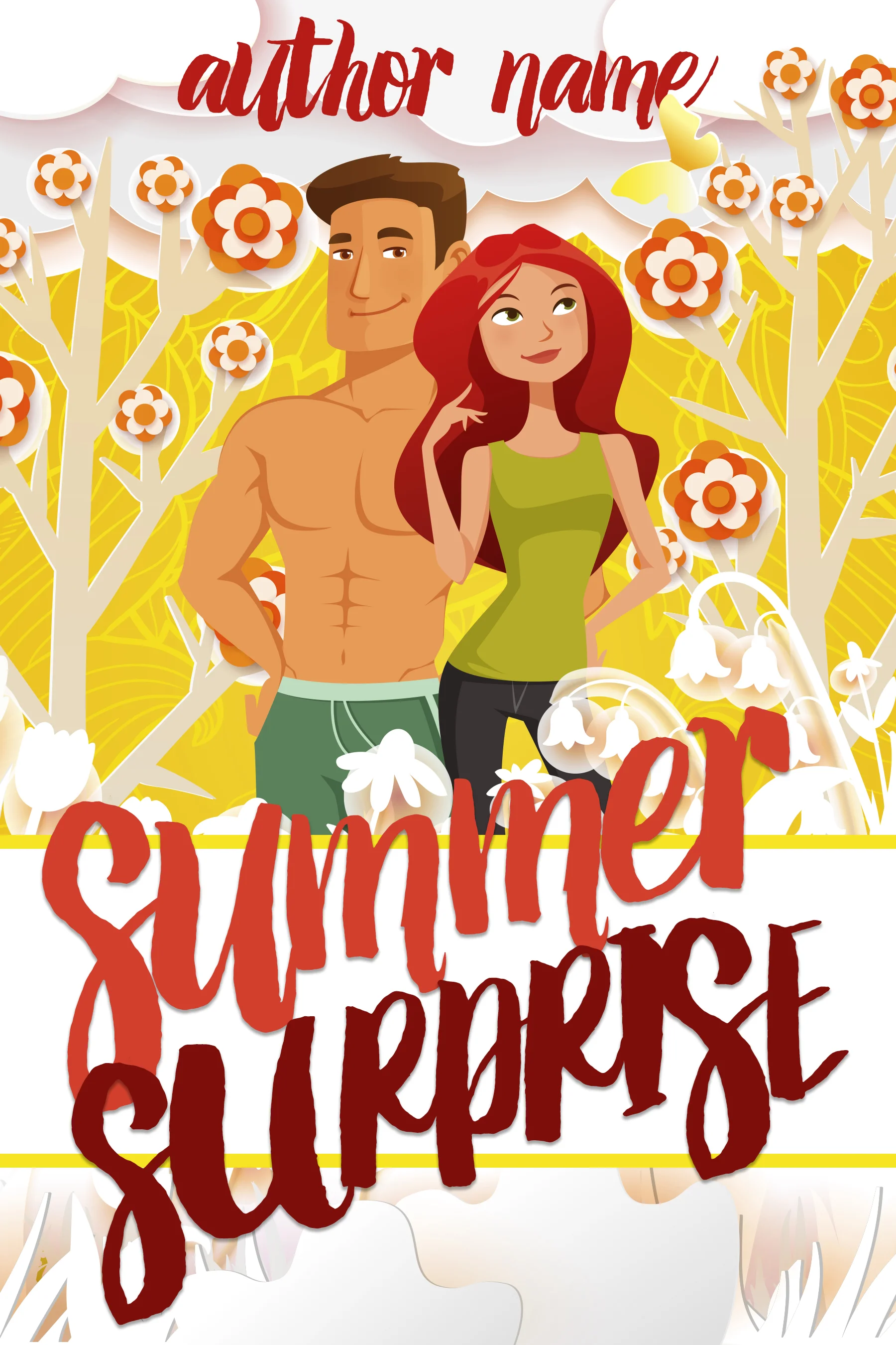
uploaded this image: Summer Surprise.jpg
Marya Heidel [7:57 PM]
A Cosy mystery premade, very cute and fun.
Marya Heidel [7:58 PM]
uploaded this image: Dark Angel.jpg

Marya Heidel [7:59 PM]
And that one is all fantasy... current most favorite cover I've done. ^_^
Sabrina Fish [7:59 PM]
I LOVE that!
Pepper Hume [7:59 PM]
Gorgeous image! (And only one blue one in the lot!)
Julia Mozingo [7:59 PM]
??
Marya Heidel [8:00 PM]
But you can see here that there are elements of each genre that are different. Different fonts, different placement, different elements. It's why it's important to hire a professional.
Sabrina Fish [8:00 PM]
Julia
Marya Heidel [8:00 PM]
Lol! I'm partial to reds. :wink: But Valkyrie count's in the blue/greys.
Julia Mozingo [8:01 PM]
Marya, do you only work for CTP, or do you also freelance? If you freelance, will you share your information, please. Thank you!
Marya Heidel [8:03 PM]
Oh, and non-fiction is mainly different in that it tends to be less... hmmm... fancy? There are still elements of design and it can be just as tricky, but (to me anyways) just more of a basic look. Many more typography and symbolic covers in NF.
I do freelance! ^_^ I run Strong Image Editing for any covers I do outside of CTP. You can find me on facebook and online at www.StrongImageEditing.com
Julia Mozingo [8:04 PM]
Woohoo! Thanks!
Marya Heidel [8:04 PM]
You're welcome! ^_^
Sabrina Fish [8:05 PM]
Okay, if there are no other questions, I'll take this time to say THANK YOU, Marya! That was an excellent presentation
Marya Heidel [8:05 PM]
Oh, I have a premade group too... https://www.facebook.com/groups/TheBookCoverSIEve/
Sabrina Fish [8:05 PM]
I learned so much and will definitely be saving your info for the future when I decide to go the self-pub route.
Julia Mozingo [8:05 PM]
:clap: :clap: :clap: :clap: :clap:
Sabrina Fish [8:05 PM]
Or maybe I'll submit to Clean Teen.
Robert Rubin [8:05 PM]
Thanks!
Marya Heidel [8:06 PM]
Thank you!! I look forward to seeing your submission! ^_^
Pepper Hume [8:06 PM]
Thanks so much for your time, Marya. Have already opened Strong Image in another window and will see you on Facebook!
Staci Mauney [8:06 PM]
Thank you, Marya! This was a great presentation!
Marya Heidel [8:07 PM]
And really, thank you all so much for attending. I love talking about book covers so this was a real treat. If you have any other questions feel free to message me on facebook or email me. ^_^
Sabrina Fish [8:07 PM]
Thank you everyone for coming. We'll be having our next Virtual Workshop in July. See you all in May!
Marya Heidel [8:07 PM]
And Sabrina and all of the OWFI peeps, thanks for inviting me!! ^_^
Julia Mozingo [8:08 PM]
A wonderfully interesting presentation. Thank you!
Marya Heidel [8:08 PM]
You're very welcome.